Dr . Leong Yap is a professor of the Design at the school of Art and Design , He was trained as the industrial designer at Wellington polytechnic , New Zealand . He was also a member of the New Zealand Growth and Innovation Framework (GIF) Design industry Taskforce to advice the New Zealand Government on design stratergy and policy in using design as a key driver for the national competitiveness and enabler to wealth creation and economy growth .
It was a very inspirational lecture by Dr.Leong Yap
as he said ,
Design should be '' DIFFERENT OR DIE ''
he said , lets think new, new creations and innovations by using the blue oceans stratergy .
he stressed on designing something new that does not exist , and not modifying something that exists .
for instance , apple product took over the globe, all other products are no more in demand. why ? because its a new creation .
when you design a product make sure it satisfies the customers.
he also mentioned a few places that has their products globally recognised,
for instance ,: Finland , the whole economy of that place is just based on one product that is '' NOKIA''
which is known globally .
he insisted on thinking new, creating something new so that we do not have much competition . and our products would be a hit .
it was a very interesting lecture , he did inspire us with his work . and i am hoping i will get there someday .
Thursday 6 December 2012
The Pangkor Trip
The pangkor trip that was held on the 28th of november ,I was really excited for it and i was really looking forward to it . We took a bus to the ferry . on reaching pangkor we were assigned with tasks and each group got busy working on it .


It was a memorable trip as we had alot of things that we did together, solving each task was crazy but fun at the same time , the first day we had to crack a code which was a bit difficult at the start but we finally figured it , the very same day we also rode bicycle around the island which was amazing .
The next day , we went to several bays before going to the island where we had our next task .
To highlight a bit about these bays , very interesting part about it was that each bay had stones that resembled some still life or animal .
we first saw this stone that looked like an ''APPLE''

Then we saw a stone that looked like a '' TURTLE ''

We also saw a stone that resembled a ''CROCODILE''

I found this very interesting , this is real beauty of nature .
The ocean was amazing as always here are some photos of it .


we also went snorkeling and it was a great experience .

After this , we went to the island called '' the monkey island '' where there were alot of monkeys ,
we had our tasks to do , we had to make shelter using available natural materials , which was actually a fun thing , we used tree branches and logs to make a big shelter which could accommodate 4 people and more , we then had to make a raft ,and we had to make sure it was sustainable , which is we had to make one person float on the raft , we used 3 pieces of logs and held them together to make a raft . after all these activities we headed back home .
everyone was really tired but we still went for something that was the best , THE BANANA BOATING.
the best part was the sunset was amazing during this ride , and it was fun too .


the next day we went to do our other tasks, we went to several chinese temples, where there were quite alot of interesting things , such as painted carves on the stone.


there after we went to the Dutch fort , its a very interesting site.

there after we headed back home and every one was preparing for the final presentation for the night . after the presentation we achieved the second position . and we were all happy .
we also did some night photography .

This was all about the pangkor trip . it was one of the best we had , and the memories will always be treasured.
Monday 12 November 2012
GrEetinG caRDs
Series of Greeting Cards.


Making of the envelopes
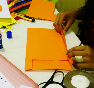


materials used is a hand made sisal strings paper which is put together in different colors, card boards not so thick not so thin which is shiny and off - whitish color.
As for the envelopes are hand made as well , picked each color accordingly and ribbons and cotton wool for decorations . first i cut them into the shapes , then using super glue i stuck them on the card board. in order to give it a 3D effect i doubled each papers. additional decorations for the sock , i used cotton wool giving it that xmas look and blue slim ribbon for the birthday boxes . As for the texts the fonts i used normal hand writing in order to maintain the theme of hand made. simple colored pens can be used for texts.
Materials used for making the shapes


Example : christmas sock .

Making of the envelopes


FINISHED ENVELOPES .

placing the shapes on to get a good composition .


GREETING CARDS WITH HAND MADE ENVELOPES

Tuesday 16 October 2012
assignment 7b - group work - color wheel.
COLOR WHEEL.
A color wheel is an organization of color hues around a circle , showing relationships between colors considered to be primary colors, secondary colors , complementary colors etc. the wheel also shows more and more mixtures between the colors, such as red- orange , yellow - green and so on . therefore a color wheel shows the relationship between colors accordingly.
INITIAL IDEAS.


 ..
..

A color wheel is an organization of color hues around a circle , showing relationships between colors considered to be primary colors, secondary colors , complementary colors etc. the wheel also shows more and more mixtures between the colors, such as red- orange , yellow - green and so on . therefore a color wheel shows the relationship between colors accordingly.
INITIAL IDEAS.


we finally came up with this idea of making a ape man like and a bubble but with a zig zag pattern .
and also to show our colour transition from left to right in a up to down zig zag way.
we used wood and we sprayed it white in color to let the colors stand out. to give it a rough texture we used rice . we first glued the rice and then painted them accordingly. and we mounted it with a black frame to give the rectangle shape.
COLOR WHEEL IN THE MAKING
FINAL PRODUCT
 ..
..
RICE PAINTED COLOR WHEEL .
Tuesday 9 October 2012
colour - assignment 7A
COLORS


I chose the subject matter to be a face. and i also decided to do it manually as i wanted to see what it would look like when using cool colors and warm colors .
from this activity i learnt the hue concept . also the different shades of colors.
however , being more particular on mounting the work including spacing would give it much better effect. note: when mounting anything using spray glue is much preferable results to neat work without leaving any unstuck part of the paper.
Tuesday 2 October 2012
FonTS - exercise


I have learnt that , for every color there are different meanings to it , and therefore the fonts we use are related to it as well. however in design i feel it is very important to know what does each colour represent in order to come out with great designs .
Taking the first page ,
The first word which is BROWN in color , this color represents stability calmness, cousy . therefore i have represented it using the font - zeyada, and the word used here is " comfortable''
next word is Cinderella, i have represented this in PINK and the font used is Janda Fabulous. as pink represent feminine , cuteness and so on , i have used a fancy ,girlish like font for it .
the third word one this page is my name ALYA, i have used YELLOW colour to represent it , because yellow shows cheerfulness , attracts attention and more, and i feel out of all the colours this one is quite good. and the fonts i have used is A Charming Font Expanded.
Second page ,
The first word is passionate which is shown by the color REDwhich shows different emotions like love , dangerous , power and so on, and the fonts i used here is elizajane.
The second word is confidence , i used the colour BLUE to represent it , because this colour shows boldness, trustworthy , serenity and so on . the fonts i used for this is Empire State NF.
and last word on this page is elegance , i have used BLACK because this shows sexiness, stylish , black also makes people look slimmer, maturity and formal . the font i used for this is Louvaine.
Third page .
The first word is Innocence this is represented in WHITE which shows purity , see it as angels. and so on , the fonts used are elizajane2.
. The next word is witch craft which is represented by PURPLE which shows mystery , magic , and so on. the font used here is YouMurderer BB.
The last word on this page is depression which is represented by GREY which shows dull, low profile like thing . the font here used is Haettenschweiler.
To conclude , through this exercise i have learnt about each colour and their meanings. how they reflect on different emotions and how the fonts are used according to that .
Tuesday 25 September 2012
Assignment 5 - paper cut art
PAPER CUT ART WORK , SHOWING SYMMETRICAL , BALANCE , SPACE AND DOMINANCE


This paper cut art work shows symmetrical and balance composition , i used pink colored paper on a black mounting board to complement it .. and the design i used for this is just random pattern that came into my mind while making this work .
PAPERCUT ART 2


This piece of work shows space and dominance , i have used different colors to make it look bright and eye catchy , i used a black moth with yellow to make it look outstanding . and i also tried to make it look 3D , by sticking the middle part on the board leaving the petals hanging .
Rule of third-Shoes
basically the subject matter here is shoes. i took 50 pictures of different shoes at different angles using a black mount board frame . applying the rule of third , i came up with a story line as well as some narrations to make it look like a movie .
so enjoy :)
taylorspod.blogspot.com
class activity - A Brochure
front page

inner first page


3 inner pages

sixth last page

Monday 17 September 2012
Grid
The Golden Ratio :


GRID : is basically a pattern of horizontal and vertical lines spaced out at regular intervals, forming squares or rectangles . depending on what sort of grid we make the sizes and shapes vaires accordingly.Depending on what size and shape the following are part of forming a grid , these are : gutter , margin , column , row , flow line , module and spatial zone.
A hierarchy is an arrangement of items (objects, names, values, categories, etc.) in which the items are represented as being "above," "below," or "at the same level as" one another. Abstractly, a hierarchy can be arranged as the top level , then middle level and lower level.
To create a hierarchy you header which is the main and top most part of the page . then comes the sub heading which talks more about the heading and then lastly the body where all the details are placed.There are several grid variations, these are Golden Ratio , Rule of third , Columns and Baseline grid.
Golden ratio is mostly used when web designing , rule of third is used for basic making of photos, columns separates vertical paragraphs and base line grid separates horizontal lines from each other.
Therefore , using these rules and variations we could come up with different layouts.
Thursday 6 September 2012


Subscribe to:
Posts (Atom)